Table of Contents
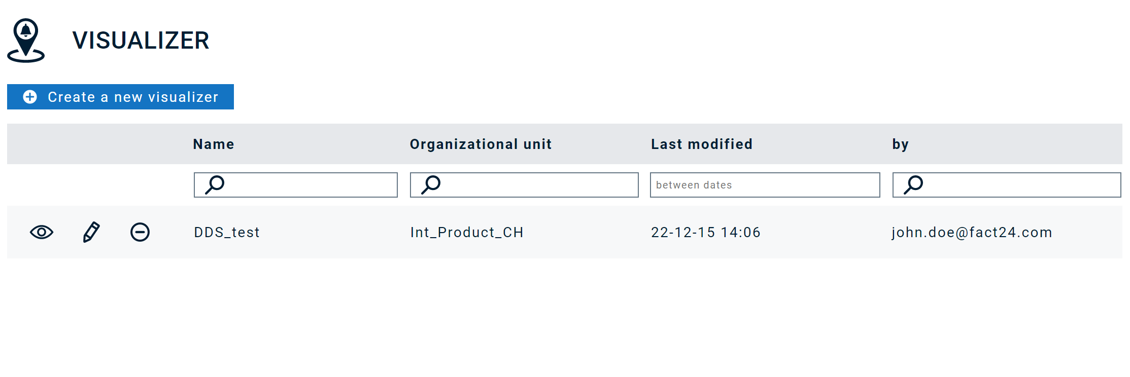
Visualizer
The Visualizer is accessible via menu item "Operating cockpit" and serves as custom interface that you can design based on your organization's needs to trigger and monitor alarms.
There are two modes to access the Visualizer:
- Edit mode
- View mode, which you have to select e.g., in order to start an alarm from the Dashboard
Let's create / edit a Dashboard
- Name: Enter a unique name here.
- Oranizational unit: Select the organizational unit that this Dashboard should belong to.
Once you click "Save" you will see the following areas:
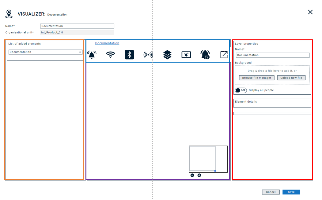
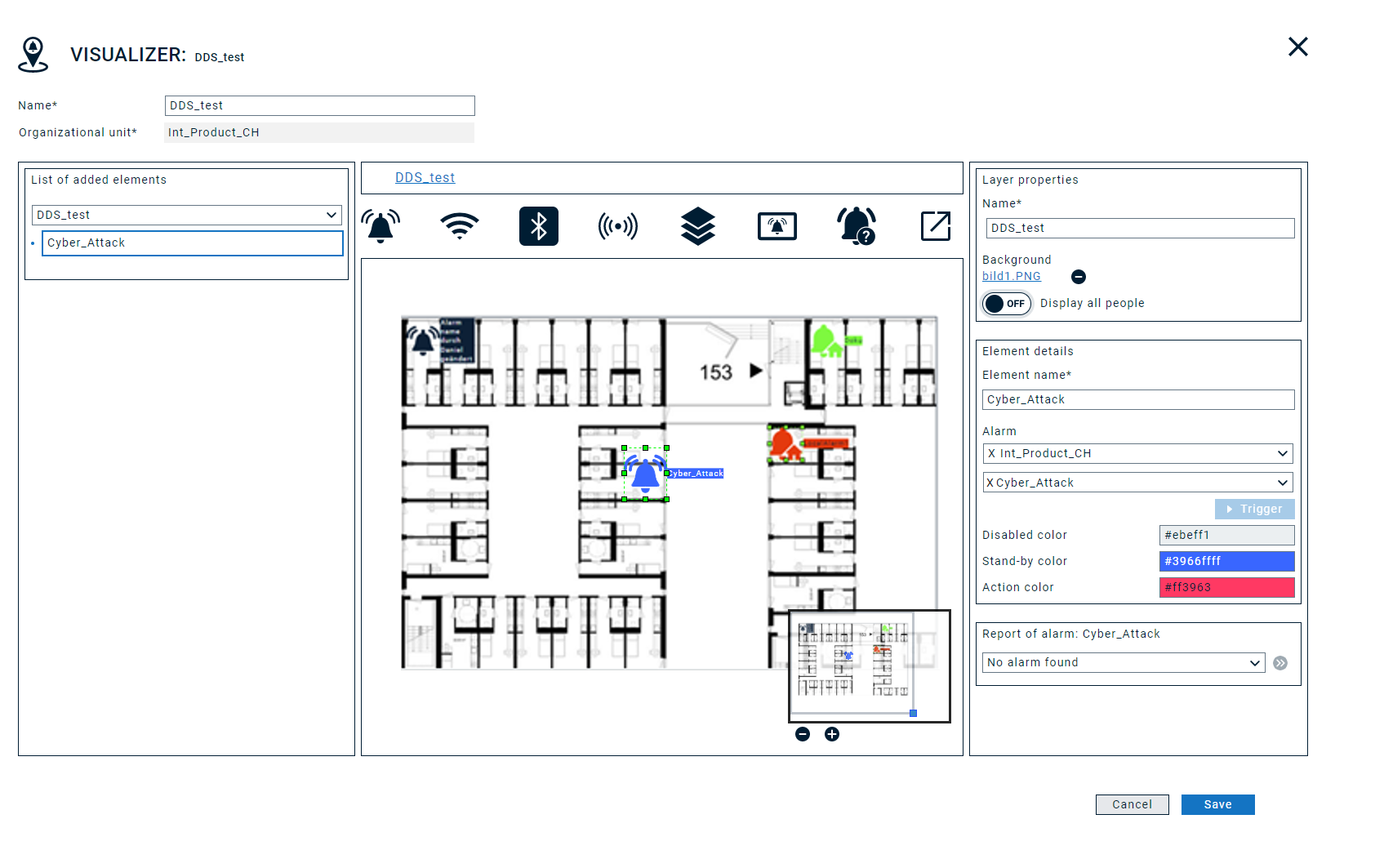
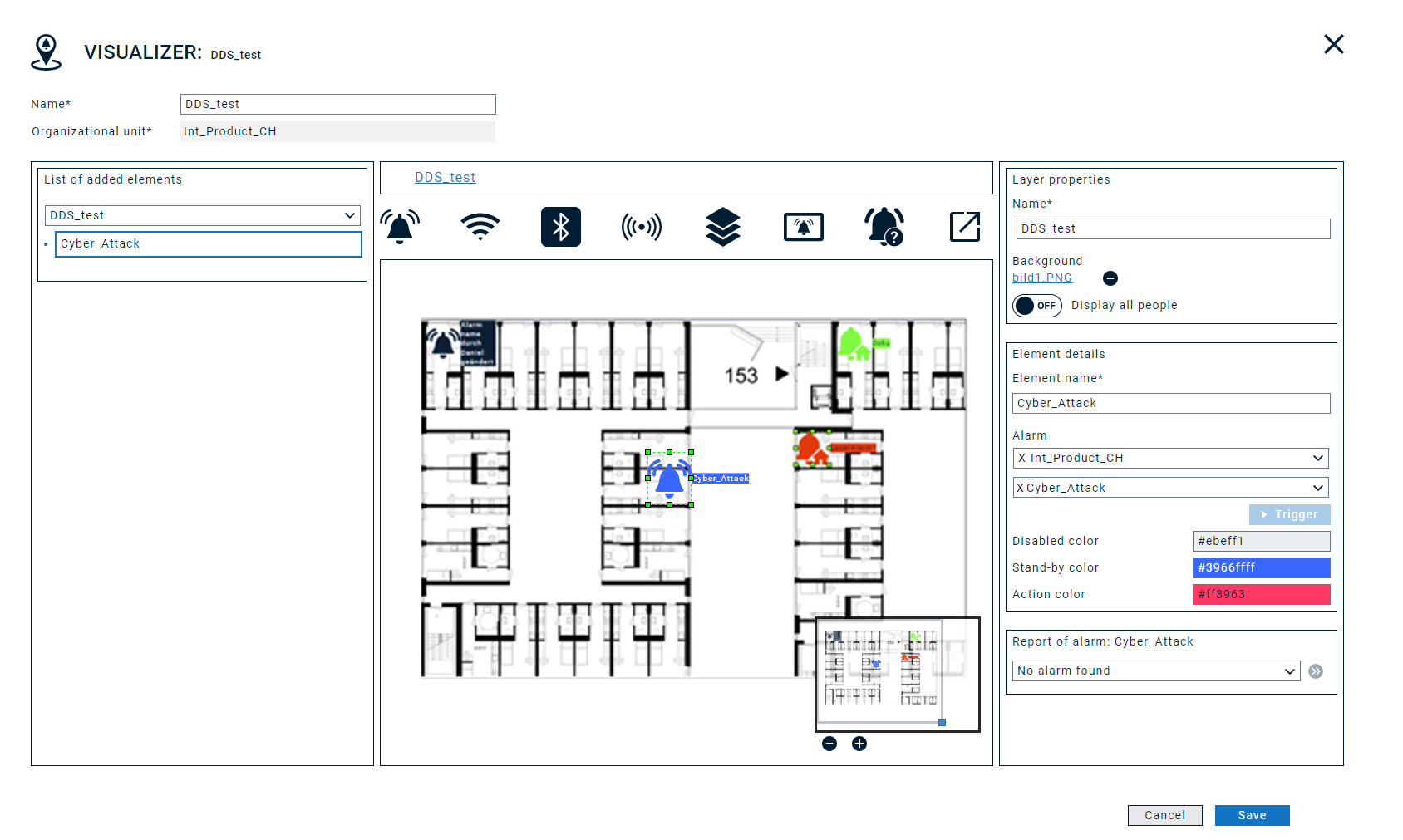
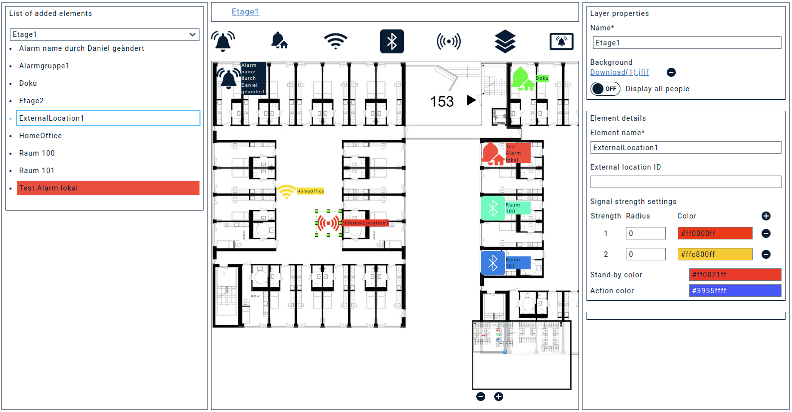
The Canvas view can be divided into the following sections:
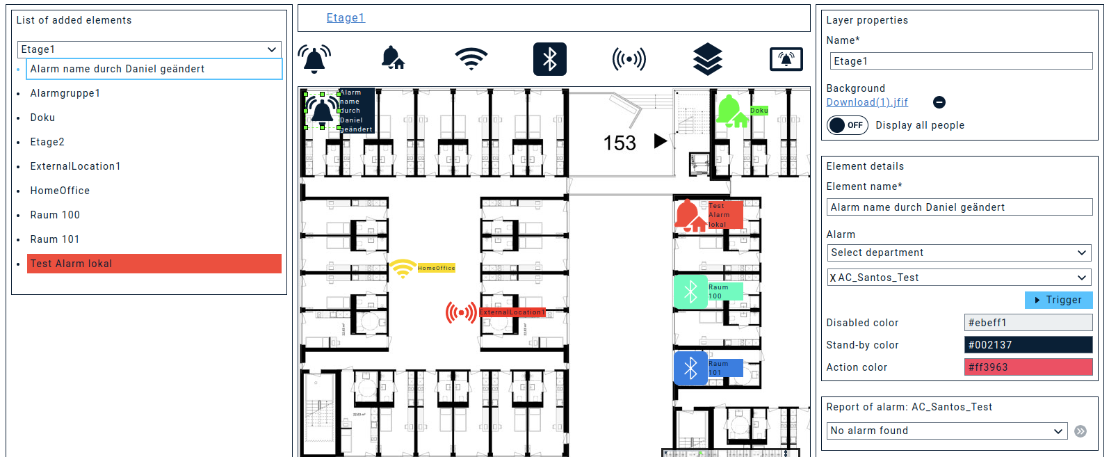
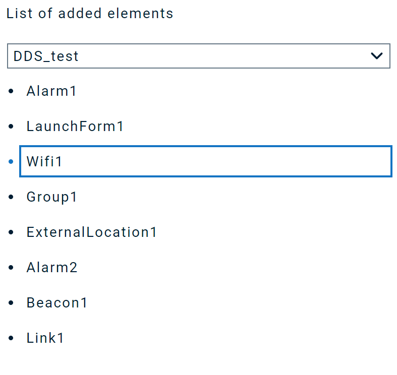
- List of added elements: shows all elements you added to the canvas
- Breadcrumbs: shows addresses (like URL or file paths) and object selection
- Canvas: Your design space with focus/zoom window
- Layer properties and Element details: shows you detailed settings for a selected layer or element
If you then click "Save" for the next time, you will be able to upload a background image for your first layer.
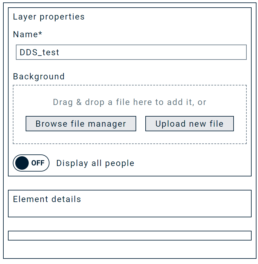
The selected image will then appear on the canvas. It should be fit to the screen resolution for full-screen mode. If this is not possible, you can of course always work with the Zoom window.
Once the upload is completed, the change must be saved.
The name of this first layer will automatically be set according to the dashboard name. Of course, you can change this to a custom name of your choice, e.g. "Grundriss".
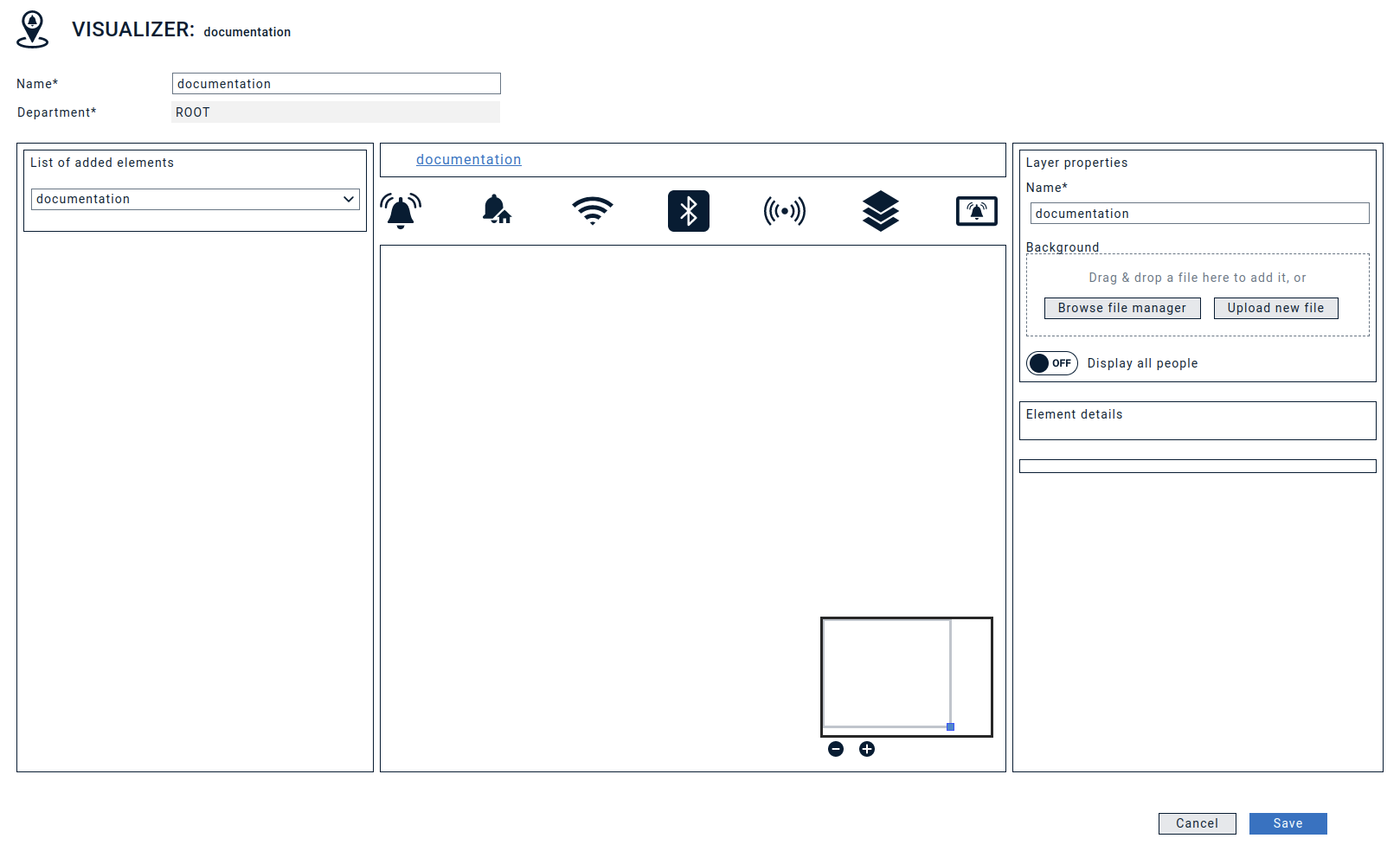
Zoom / focus-area
The small box at the bottom right of the canvas can be used to move and zoom within the canvas.
Functional areas
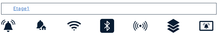
You can then select functional objects from the breadcrump area and drag n drop them onto your canvas:
- Cloud Alarm
- Local Alarm
- Location object
- Groups / Layer objects
Let's take a look at the different functionalities:

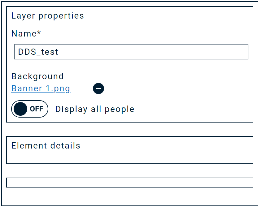
1. The cloud alert can be positioned on the canvas via drag'n drop from the Breadcrum bar. Once you position the Cloud Alarm icon on the canvas, it will be automatically called "Alarm N" and colored in the pre-defined base color. As long as you keep the object selected and it appears with a green frame, you can change the size of the object. In addition, you can change icon name and color in "Element details" on the right:
- Element name: Here you can manually change the name of this element.
- Display all persons: Shows the total number of located persons/extensions in the item overview.
- Alarm: Here you can assign alarms from different organizational units (based on your access and the organizational unit you selected for the dashboard) that should be triggered if this element is clicked.
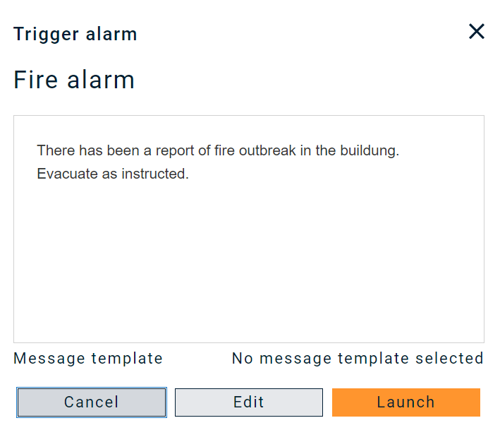
- Trigger: Once you selected an alarm, a "Trigger" button will appear. Clicking on it will start the alarm - exactly in the same way as you would do via Activate alarm.
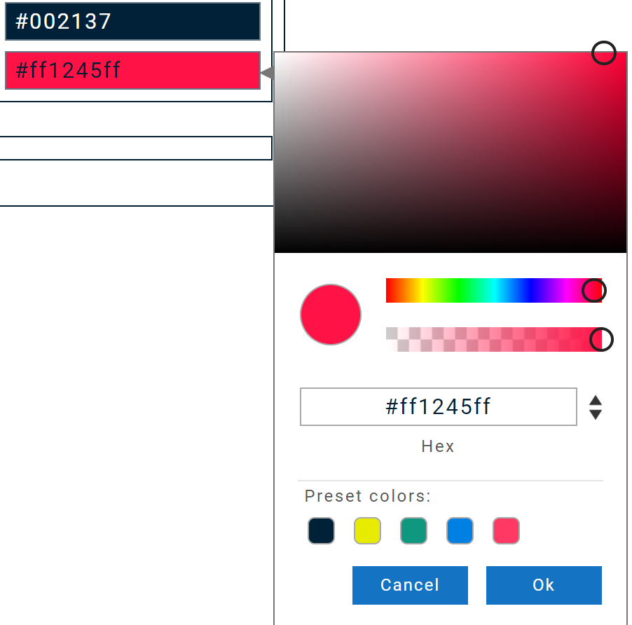
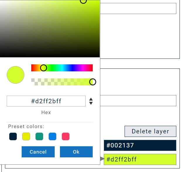
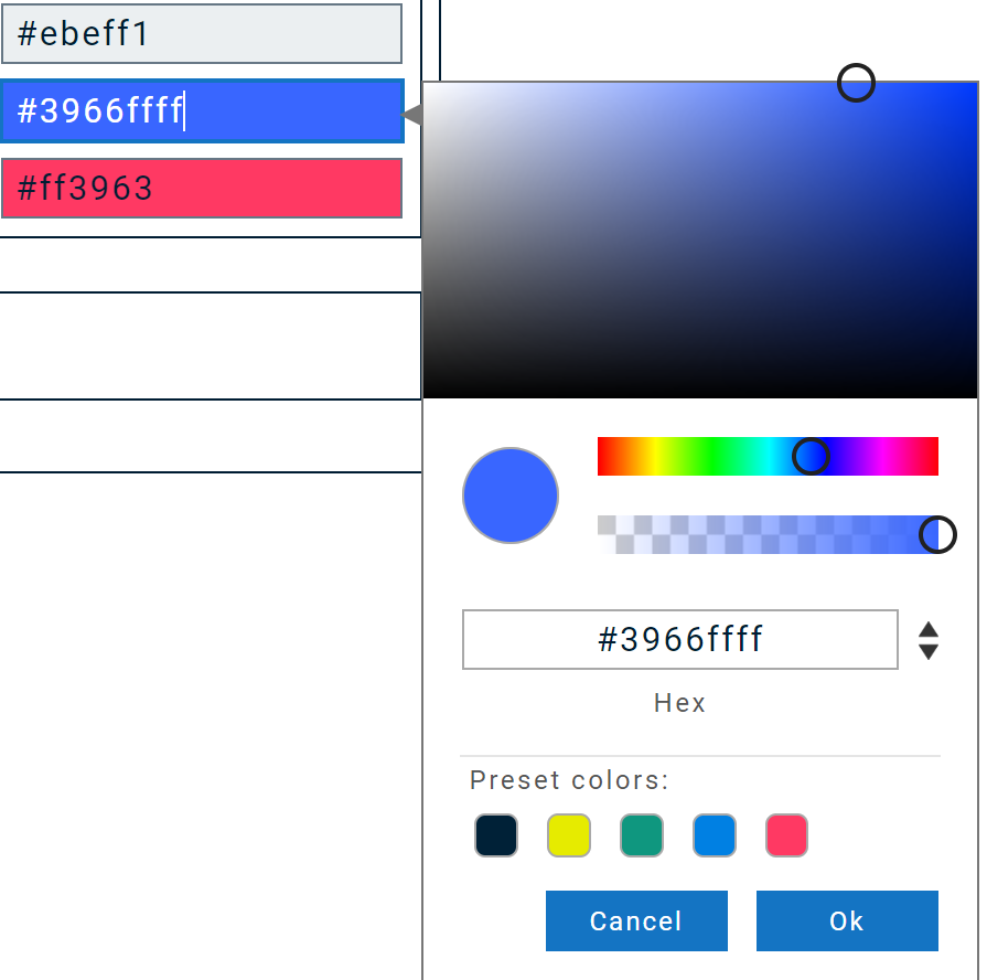
- Disabled color: Color that the alarm element shall have when the associated alarm has been deactivated. Colors can be set as HEX code or via the color picker.
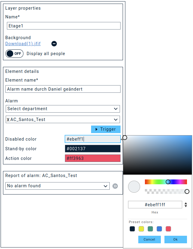
- Stand-by color: Color of the element when the stored alarm is inactive.
- Action color: Color of the element when it is active --> the stored alarm is currently running. The color is also displayed in the element list.

2. Also local alarms can be added to the dashboard. However, only their status can be monitored (if this is activated in the alarm settings) but they cannot be triggered from the dashboard. For "Known local alarms" (alarms that are synchronized to the web portal via the Media Gateway) you can directly select the alarm to be monitored from a drop down menu. For unknown local alarms, you can enter the local Alarm ID. This ID will be displayed in the Media Gateway and sychronized back to the Dashboard.
2.1 Element details - Known local alarms
- Element name: Name of the selected element. This name is automatically generated during the initial drop, taken over from the selected alarm or can be set manually.
- Known local alarms: Option to select the alarms from the database of known local alarms. If this option is active, the drop-down list of known local alarms appears. Local alarms cannot be started from the dashboard. Only the status is displayed. The option for status transmission must be activated in the respective alarm.
- Disabled color: Color that the alarm element shall have when the associated alarm has been deactivated. Colors can be set as HEX code or via the color picker.
- Stand-by color: Color of the element when the stored alarm is inactive.
- Action color: Color of the element when it is active --> the stored alarm is currently running. The color is also displayed in the element list.
2.2 Element details - Unknown local alarms
- Element name: Name of the selected element. This name is automatically generated during the initial drop, taken over from the selected alarm or can be set manually.
- Known local alarms: Option to select the alarms from the database of known local alarms. If this option is inactive, a text field appears for entering the local alarm ID. This is displayed in the media gateway. The alarm ID is automatically copied to the clipboard when the option to transfer it to the dashboard is activated. Local alarms cannot be started from the Dashboard. Only the status is displayed.
- Disabled color: Color that the alarm element shall have when the associated alarm has been deactivated. Colors can be set as HEX code or via the color picker.

- Stand-by color: Color of the element when the stored alarm is inactive.
- Action color: Color of the element when it is active --> the stored alarm is currently running. The color is also displayed in the element list.

3. Wifi access points and BLE beacons can be taken from the location profiles in the cloud. The configuration in the dashboard is identical and is therefore not documented separately. The objects can be freely positioned in the canvas and positioned in the "plan" at the correct location, e.g. installation location of the beacon/accesspoint in the building. The name is also generated when the object is placed in the canvas. "Beacon/Wifi+Numbering.
- WLAN / Beacon settings: Selection list of available tracking objects.
- Element name: Name of the selected element. This name is automatically generated during the initial drop, taken over from the selected alarm or can be set manually.
- Stand-by-color: Color that the location element should have when there are currently no active alarms that have transmitted the associated location information.
- Active color: Color of the element when it is active + an alarm has transmitted the associated location data. The element will be displayed as active for 1 hour from data transmission to give the possibility to perform a post-processing. The color is also displayed in the element list.
- Signal strength settings: Locate objects support up to 4 signal strength ranges. These can draw different radii per level ranges around the respective objects. The radius is set manually. Currently these radii are supported for the local locating objects via the interfaces OMAxi and ATAS.

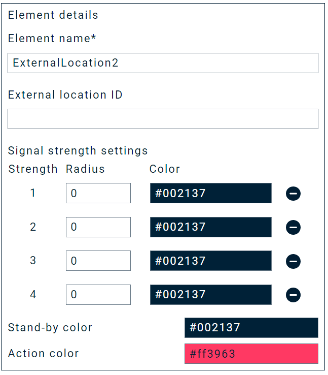
3.1. Local location objects can also be added to the dashboard. As per Nov. 2021 data of a OM-AXI interface of the Media Gateway can be displayed. Additional interfaces will follow in the future. If an alarm is triggered that contains location data, they will be transferred to the portal via API and displayed in the Dashboard. You will be asked to enter the External Location ID, which you can find in the management interface of the Media Gateway.
- Element name: Name of the selected element. This name is automatically generated during the initial drop, taken over from the selected alarm or can be set manually.
- External location ID: ID of the location objects from the media gateway. These can be taken from the management UI of the media gateway.
- Stand-by-color: Color that the location element should have when there are currently no active alarms that have transmitted the associated location information.

- Active color: Color of the element when it is active + an alarm has transmitted the associated location data. The element will be displayed as active for 1 hour from data transmission to give the possibility to perform a post-processing. The color is also displayed in the element list.

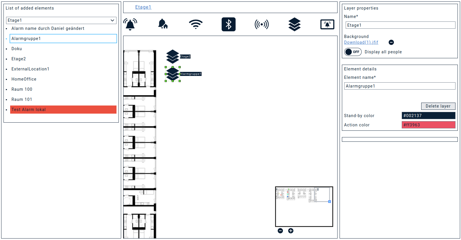
4. With Groups / Layer objects you can create an additional design layer, e.g., in order to add another floor plan or to group alarms. When dropping, the names are automatically generated "Group+Numbering".
After having positioned the object, you first have to click "save". Only then you can use this new layer to design it as you did in the layer1.
If you are in a new layer, this will be displayed in the breadcrum bar. From here you can jump back to the desired group/layer.
- Element name: Name of the selected element. This name is automatically generated during the initial drop, taken over from the selected alarm or can be set manually.
- Stand-by-color: Color that the location element should have when there are currently no active alarms that have transmitted the associated location information.
- Active color: Color of the element when it is active + an alarm has transmitted the associated location data. The element will be displayed as active for 1 hour from data transmission to give the possibility to perform a post-processing. The color is also displayed in the element list.
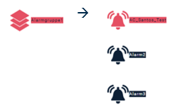

Alarm groups allow you to group up to 4 alarms. The name is automatically generated "Alarm group + numbering".
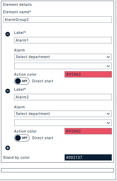
- Element name: Name of the alarm group
- Label: Label of the respective alarm. Is filled in by the selected alarm or can be assigned manually.
- Active color: Color that the icon of the alarm group shows when this alarm is active.
- Direct start: If this option is active, the alarm is started without additional query.
- Quiet color: Quiet color of the entire group, if none of the stored alarms is active.
Let's work with the created Dashboard
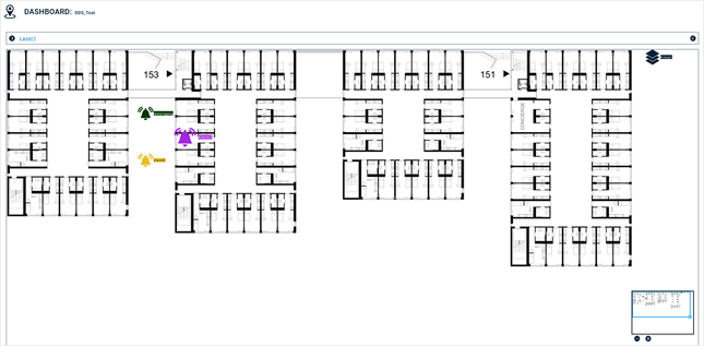
For daily use, the dashboard offers a suitable view. This shows the dashboard in full width and thus provides full overview of the generated interface.
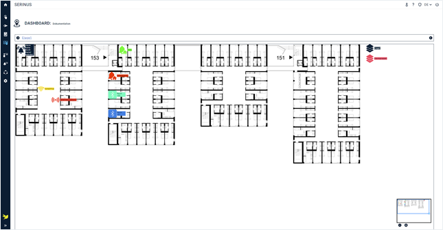
In the breadcrum bar you can see small arrows on both sides. These are "hiding" additional menus.
On the left: The element list shows the elements that are on the active layer. Active elements are also marked here with the Active color.
On the right, you will find the element details, so e.g., for active cloud alarms you will find alarm details and by clicking on the double arrows you will be automatically taken to the alarm report.
Alarm triggering
If you double-click on a cloud alarm icon, you can directly trigger the alarm, as you could do if you navigate to Activate alarm.